Tuesday, 29 April 2014
Monday, 24 March 2014
Final Digipack Design
This is our Final Digipack design. I changed the positioning of the front cover and track list so that it positioned correctly when folding up the Digipack for distribution. Before, the positioning of these specific sections were in different places and it didn't line up correctly when I printed out and folded up the Digipack to look for any problems. I also changed one of the inside images, instead of having the picture of the boat spotter binoculars I changed it to another band shot so that it informed the Digipack with more images of the band.
This was the previous design, it had too many images of the beach on it and also some of the sections ended up being positioned in the wrong place. This was edited and corrected to finalise the outcome which can be seen at the top of the post.
Final Magazine Outcome
This is our final Magazine Poster. It uses the Instagram Template, and includes everything which could be seen on a magazine advert to advertise a band.
We Included the band's name, the album name and the date of release. We also added how the album will be available to purchase. As well as this I added some quotes from famous Music Magazines such as NME and KERRANG. These quotes will show the magazine reader that our band is well known and people from these companies like our music.
I was going to Include our Instagram account names with a little Instagram Icon but I thought that if anyone wanted to find us on Instagram then they could enter the name 'TheCoasts' as this is on our poster and showing our Account name. If you were to watch our music video you would see our Instagram names and would be able to follow us on there anyway, so I thought to save space and make the advert not look as crowded I would leave Euan and I's Account names off it.
I started to re-design our poster. This was my first idea, to use the Instagram template and put the same picture inside the template as our Digipak front cover. I soon changed my mind as this image was too dark and would need to be in the bottom left corner to show what the album looks like anyway.
I then started designing with a different inside image. I tried using the picture which is on our front cover image of our Digipak but instead of merging the photo with a band one too, I left the Photo on its own and brought the saturation and brightness up so that it looked more summery and complimented the stones and water.
This picture looked much brighter and went better with the whole advert. It would be more eye catching if you were turning over the page of a magazine.
I added in our Music label logo which I created at the start of the course. Our label is called RecordRecords. A play on words, and a cool little logo to go with it. That is on the far left of the mini icons along the bottom. I then added in the iTunes logo, Soundcloud and Spotify so customers know where to find and buy our music online.
I didn't really like the text in the middle in one big line, it looked much better separated into two lines, it broke up the advert a bit more, was easier to read and also didn't look as lost for space.
I then changed the positioning of the picture, there wasn't enough colour being let into the picture when it was just the waves and stones. So I raised the picture to the right a bit which left me with a picture that incorporated more colours and actually got some of the background rocks in too.
I lifted the image up even more so that I could now see more of the rocks. This looked better but used too many dark colours. I lifted the image even more which allowed me to get the horizon in too. It is crazy how many different outcomes you can achieve from one picture. This picture positioning was much better and had the correct amount of dark and light colours in, while using the green as a way to bounce off the text colour. This colour was too bland though, I needed a blue colour which would match the water and contrast nicely with the green moss on the rocks.
I then changed the positioning of the picture for the last time, and then decided if I changed the colour of the text to the same colour as the Instagram template, a royal blue; then this would compliment the blue nicely and would all match up and create a ocean coloured theme within the advert. I also tried the magazine quotes a little lower to see if they looked better there but they weren't visible enough through the dark coloured blues and bronze coloured rocks at the bottom of the image.
I also changed the colour of the text below the main Band Name and Album name. This colour was the same as the Instagram blue but I made it a little bit lighter so it wasn't as prominent as the top text, as this was more important.
I then put the Icons in the bottom right corner so that I could put the album cover in the bottom left, it looked better like this.
And that was the final steps of creating the magazine advert.
Sunday, 2 February 2014
Instagram Idea
Throughout our Video, Poster and Digipak you can see that we have incorporated the Social Networking site Instagram.
Instagram is a well known Photography Social Media App and Website. You are able to upload Photos and Videos which you can take on your Mobile Phone, or on the computer. These images and videos can then be viewed by your Followers, and everyone else who has an account.
The idea of using an Instagram Template over the vocal parts of our video when we are singing on the beach was thought of when we were piecing together our video. We realised that there were two or three clips which we wanted to use, but during filming the camera was turned portait rather than landscape which meant when it was added to the video they either looked weird and were the only potrait piece of footage, or we could have zoomed in about 60% which would ahve made the change in camera positioning not as visible but this cuts out most of the action and lip syncing which is being played out.
We then started thinking how we could wrap something around these certain video clips to hide the fact that they were potrait. We couldn't reshoot these scenes again because the weather wouldn't have been the same and it would look misplaced and unconventional.
If we were to include some way of showing our fans that we are promoting ourselves and our products then this could add to our star image and potentially gain us more fans and get our name more well known. We noticed that a lot of other bands and Music Artists used Social Media as a way of promoting themselves and allowing others to see into their life so they become interested in them and eventually their products.
Indy artsist are most renound for using Social Media a a gateway into the Music Industry, a few names have become well known and famous musicians through the use of Social Networks, such as Mackelmore who sung Thrift shop.
We decided we could create an account which would look like we are promoting ourselves and if we then added he Instagram template to our Video, around the clips which were filmed potrait we would then defeat the noticable change in camera positioning and would leave us a gap to then link all of our products together by using the idea of Photo Editing and the Instagram account in our digipack as well as poster.
I started with this template but realised it was the old template. I took the middle image out and added a band shot image of Euan Tess and I.
I changed the name by making a text layer on Photoshop. I matched up the text until I found the correct font which matched Instagram's font type.
This the Band Image which I replaced the old Image with.
I then downloaded a picture of the new style template and deleted the inner Image. I added a band image in the top left corner. This is usually where the Profile Image goes. I even added in my name, and a location. This location was the same as the beach we filmed at. I created a name and accont for me, Euan and the main band. I named them 'CharlieTheCoasts' EuanTheCoasts' and 'TheCoasts' i changed the templat on the video to Euan's account template so that fans and followers realised this was on Euan's profile, and that my video was on my seperate account. On the Digipak template I changed the Instagram account template to 'theCoasts' so that all of the templates were seperate and for seprat accounts. This is to show fans and the public that we all have seperate accounts and that our accounts are linked to the video and products which we are creating for our new CD, Oceans.
Costume List
Costume List
The costumes which we wanted to wear in our video had to represent previous Indy Music artist's fashion ideas. we also wanted the costumes to be of the style which fans would wear too. This style is very 'hipster' and includes skate brands such as Carhartt, Volcom, King, Penfield and other makes of this kind. The jeans which they would wear would representally be skinny, the pictures of jeans below are not skinny but as you can see in our video we are wearing skinny jeans.
The colour jeans which we are going to wear and a wahsed blue, and a dark denim blue. They will be skinny.
We will also be wearing hats, I will be wearing a hat called a 5 pannel, as its made up of 5 pannels which are assembled together. Euan will be wearing a snapback which is more fitted to the head.
Tess will be wearing a Vintage Grandad jumper. It will incorporte collours such as pink and baby blue, to show she is a girly girl and is into colours and a bright jumper could also give an idea that she is into art etc. She will also be wearing Leggins. Leggins are a tight material which act as trousers, they can sometimes lso be called jeggins, but in this case she isnt wearing jean coloured leggins, she is wearing black coloured leggins. Tess will also be earing a pair of well known shoes called New Balance. They will be bright blue, again to show she is a colourful person and because colour is a big thing in this sort of fashion sector.
I will be wearing a Shirt which has a patched design just like the one below, I plan for my shirt to include the colours Cream with thin Blue and Pink lines. I will wear a T shirt underneath this, and will wear the shirt open. the shirt I will be wearing is a plain White Thrasher T-shirt. Thraser is a SkateBoard mgazine make which is well known in the fashion industry. I will be wearing light blue washed skinny jeans. Skinny jeans are renound for Indy artists to wear, it used to be only rockers who wore skinny jeans but it has now spread as a trendy and 'hipster' fashion trait.
I will also be wearing a pair of plain black Nike shoes, with a white sole. These shoes are very simple and plain but I dont want anything too bight drawing any attention away from Euan and I singing, or the acting on the beach. The shoes are also Skater shoes which is classed as 'hipster'.
Euan will be wearing a pair of black Vans. These are a very well known pair of branded shoes. A lot of people wear them now a days but they were originally designed to be a pair of Skate shoes.
Euan will be wearing a Shirt also. His shirt will be a Dark Red and Navy Blue colour. He will also be wearing a plain White T-shirt undrneath. Shirts can be seen as quite smart, but if you add a plain T underneath, it takes the edge off it and can give you a trendy look which also represnts how Indy artists dress. Euan will be wearing skinny dark denim blue jeans.
Video Editing
Editing our music video.
Throughout the production of our music video, I took several screen shots so that I could write about the hurdles we came across, and to show you how we achieved some of the effects which you can see in our video.
Markers
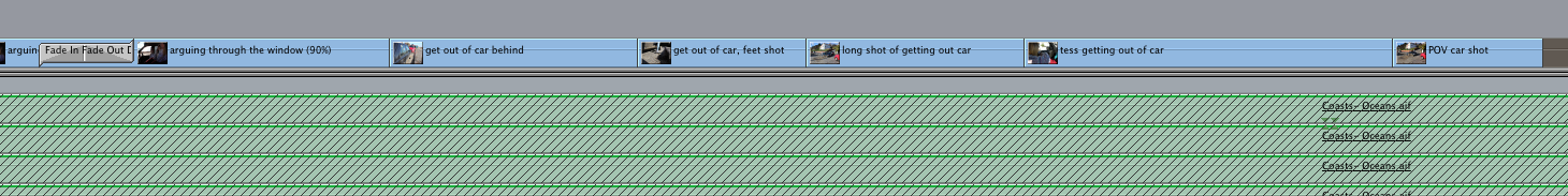
In the image below you can see the red markers on the timeline of the video. We used these for many things, mainly they were used to mark on the song when the lyrics started; so that we could then place a marker on the timeline allowing me to match this up with euans lip syncing so both the song and the footage matched up and stayed at the same pace. We also used markers when marking a specific part of the song. For example there was a part of the song where it build up to an intense section, and then dropped into the song again, we caled this the drop; we wanted the video of me throwing a rock into the sea to come on a the point where my arm lets go of the rock, but for it to match to the beat dropping I made it easier by placing a marker where the beat drops, and then cutting the footage of me throwing the rock so that it started just before my arm lets go of the rock. This meant the video matched up with the drop and didnt take ages to match it up, which it would have if the marker werent used.
Speed Changes
Changing the speed of our footage also helped us fit the video with the song beat. For example we wanted the waves to crash into the rocks intime with the beat, to do this we used a technique called Rythmic Editing. To do Rythmic Editing, you create a Slug and then play the video, as the line goes up the timeline it will be playing the song, you have to hold down Ctrl and then tap V on the keyboard when you want the Slug to be cut. This then cuts the slug up into sections which match the beat of the song or a beat of your choice and then this means you can drag your selected clip into the slug. So for the waves crashing into rock scene, I rhytmic edited over a slug so that I could have two seperate slugs which would change when the beat is changed. I changed the speed of the first slug so that the waves approached the rocks slowely, and as the beat which I chose delivers, it then changes to a more sped up version of the clip as it hits the rocks. To change speed of the clip, I chose a rate of 40 to approach the rocks, and then 110 after hitting the rocks.
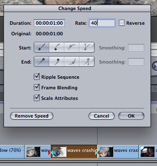
The image below shows you what a slug looks like, its basically a blank section of footage which can be chopped and have other footage dragged into it, according to the type of feeling which you are trying to achieve through the pace of the changes.
JumpCuts
We also used jump cuts to speed up the actions taking place in the story, it makes the footage flow better and allows you to change the cuts in time with the beat, etc.
This is another part of the video where the waves crash into the shore, for this I didnt use a slug and rythmic edit in the beat, Instead I just got the whole clip, and split it up using the cut tool. I then deleted the middle piece of footage which then made the two outside pieces of footage join together and jump from one position, rolling up to the shore; to then all of a sudden crashing into the beach. This looked abrupt and cut the shot up, taking a couple of seconds out of the roll up. We also used this technique when piecing together some of the performance footage, when Euan and I walk away from the set after finishing the song and when I am walking up to Tess on the beach. Walking up to the beach jumpshot was done to the drum beat of the song, so it wasnt that visible as it goes out of time with the louder soundtrack.
Overlaying Two Pieces of Footage
We tried overlapping two of our videos. This meant we could add an effect to the video by putting another video over the top of your main video, and just by lowering the opacity of the overlayed video it could act as a layered effect. I then went away and videod lighting and playing with a sparkler, I then added the footage towards the end of the music video. As the video carried on I overlapped this footage with some footage of the performanced based video, and then lowered the opacity of the sparkler footage which allowed the performance based video to shine through, with the golden glow of the sparkler over the top, hovering about for a about 5 seconds.
Organisation
Organisation sped up the process of experimenting and developing our music video because it meant we knew what clips were what and where these clips went in regards to the Storyboard. For example, after uploading our footage, we then renamed all of the footage clips so that we could select what clips we needed quicker, without the hassle of having to rewatch them to find out what was what.
We even added in the name of the shot type so that if there were multiple clips of the same scene but in different shots, then we could recognise each seperate clip for what it was, by reading what shot and angle it was. This saved us time and made the whole proccess of editing a lot easier.
Transitions
To make our video flow smoothly we used transitions between some of our different video clips. We stuck to one main transition type so that it didnt look confusing or too overcomplicated by including lots of transition types. We chose to use the trasition called 'Fade In Fade Out' this transition faded the video clip into black and then faded out with another clip of your choice, this helped us show the movement between frames and camera angles and also allowed us to fade in and out quicker when the song was at its peak beat points, to a point where there isnt even a fade because the song is going so quickly, and then down to a fade in and out which shows more black when fading as the song is slower.
On the left here you can see the Fade In Fade Out transition banner on the timeline, it sits on top of both the clips which allows it to fade the clip in and out.
We didnt use many effects in our video, except at the end after I smash the symbol on th last beat of the song, after this symbol smash Euan and I both sway from side to side so we added an effect which made our video lag and our image drag behind us. This effect is simple and finishes off the video with a bang. It is individual and different, just adding this at the end also doesnt distract the audience throughout the video but just gives the video a finishing touch by positioning the efect where it is.
This is to show the slug, and how we can just drag a clip into the slug to fill the space within that slug. This way the slug acts as abarrier so you don't over fill the space between other shots by putting the whole clip in. Another way you can put in a select amount of video is by playing the video you want and then pressing I for in when you want the clip to start and then O for out when you want the video clip to stop playing. This also saves a lot of time and means you can select the EXACT part of film you want to use rather than trimming it when its in the timeline to find the correct section.

All of these things were both helpful in the process of editing and creating our Video but at the same time helpfull when changing part of the video after the rough draft was played to our class so that we could find out what needed to be changed or what didn't work.

Subscribe to:
Posts (Atom)